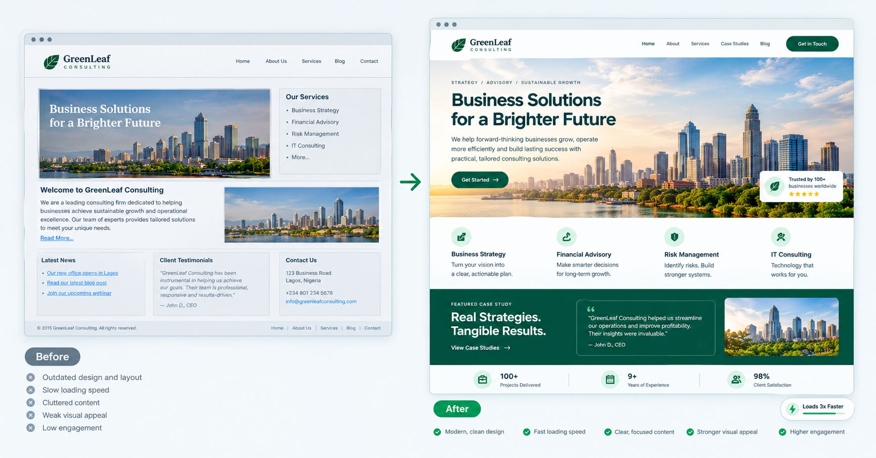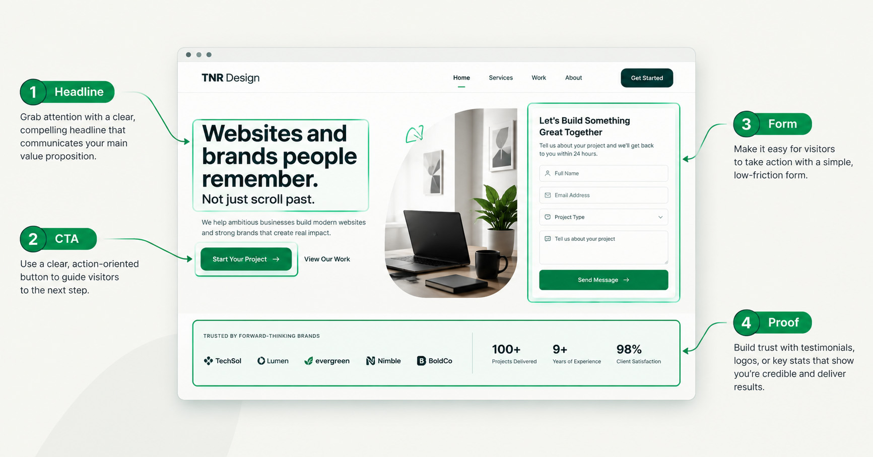

A high-converting website is one engineered so that the largest possible share of visitors take the action you want- buy, book, sign up, or enquire- and it achieves that through a deliberate combination of clear messaging, fast performance, obvious next steps, and trust signals, not through good looks alone. A beautiful website that doesn’t convert is an expensive brochure. A website that converts is a salesperson that works while you sleep.
This is the pillar guide to what actually makes a “high-converting website”. We’ll break down each element, why it matters, and how the pieces work together, because conversion is never one trick; it’s a system where every part either helps or hurts.
What “conversion” really means
Conversion is simply the percentage of visitors who complete your goal. If 100 people visit and 3 enquire, that’s a 3% conversion rate. The point of conversion-focused design is to lift that number without needing more traffic, which is almost always cheaper than buying more visitors.
Crucially, conversion isn’t about manipulation. The most durable conversion gains come from removing friction and building trust, so the right people find it easy to say yes. A confusing, slow, or untrustworthy site loses people who were genuinely interested. Good design simply stops getting in their way.
The elements of a high-converting website
1. A clear, specific value proposition
The single most important element. Within seconds of landing, a visitor must understand what you offer, who it’s for, and why it’s better than the alternatives. Vague headlines (“Welcome to our website”) waste the most valuable real estate you have. A sharp, specific headline that names the benefit does more for conversion than any other change.
2. An obvious, singular primary action
Each page should have one clear thing you most want the visitor to do, and it should be impossible to miss. Competing calls to action split attention and lower conversion. Make the primary action prominent, repeat it where it makes sense, and don’t bury it beneath ten alternatives.
3. Fast load speed
Speed is a conversion factor, not just a technical detail. Visitors abandon slow pages, and the drop-off is steep; every additional second of load time costs you conversions. This is why Core Web Vitals matter commercially, not just for SEO. A fast site keeps the people a slow site would have lost.
4. Frictionless navigation and structure
People should always know where they are, what they can do, and how to get back. Clear navigation, logical structure, and a sensible path through the site reduce the small confusions that cause people to leave. The easier it is to move toward the action, the more people complete it.
5. Trust signals
People don’t buy from sites they don’t trust. Testimonials with real names, recognisable logos, case studies, reviews, security indicators, and clear contact information all reduce the perceived risk of acting. Building trust online is often the difference between a visitor who hesitates and one who converts.
6. Persuasive, scannable copy
Most people scan rather than read. Copy that’s broken into clear sections, leads with benefits, answers objections, and uses concrete specifics outperforms dense paragraphs of features. Write for the skimmer first and the deep reader second.
7. Mobile-first experience
The majority of visitors arrive on a phone, and Google indexes mobile-first. A site that converts well on desktop but is awkward on mobile is leaking most of its potential. Mobile isn’t a smaller version of the site; it’s the primary version.
8. Strong, specific calls to action
“Submit” converts worse than “Get my free quote.” CTA copy that restates the value and reduces perceived effort lifts conversion. Every button is a small decision point; the words on it matter.
How the elements of a high-converting website work together
No single element makes a “high-converting website”; they reinforce each other. A sharp value proposition pulls people in, fast load keeps them, clear structure moves them toward the action, trust signals reduce their hesitation, and a specific CTA makes saying yes easy. Weaken one and the others have to work harder.
This is why “just redesign the homepage” rarely fixes conversion on its own. The whole journey matters, from the first impression to the final click. The best results come from treating the site as a connected path, not a collection of pretty pages.
How to diagnose a website that isn’t converting
If your site looks fine but underperforms, work through this checklist:
- Is the value proposition clear in five seconds? Ask someone unfamiliar to look and tell you what you do. If they can’t, start here.
- Is the primary action obvious? If a stranger can’t find the main button instantly, it’s not prominent enough.
- How fast does it load? Test on a real phone on a normal connection, not just your office wifi.
- Where do people drop off? Analytics will show where visitors leave; that’s where the friction is.
- Is there enough trust on the page? If a hesitant buyer has unanswered doubts, add the proof that resolves them.
These are the same diagnostics behind conversion rate optimisation, which is the ongoing discipline of improving these numbers over time.
Conversion is built in, not bolted on
The best high-converting websites weren’t decorated for performance; they were designed for it from the structure up. Clear message, fast load, obvious action, real trust, mobile-first: get those right and the site stops being a digital brochure and starts being your most reliable salesperson.
If your website attracts visitors but few of them act, the gap is rarely traffic. It’s the anatomy.
Frequently asked questions
What makes a high-converting website?
A high-converting website combines a clear value proposition, an obvious primary call to action, fast load speed, frictionless navigation, trust signals, scannable copy, and a strong mobile experience. These elements work together to make it easy for the right visitors to take action.
Why is my website getting traffic but no conversions?
Usually because of friction or missing trust, not a lack of visitors. Common causes are an unclear value proposition, a hidden or weak call to action, slow load speed, confusing navigation, or insufficient proof. Diagnose where people drop off and address that point first.
How much does load speed affect conversions?
Significantly. Visitors abandon slow pages, and conversion drops measurably with each extra second of load time. Speed is both an SEO factor and a direct conversion factor, which is why fast performance is a core part of conversion-focused design.
Is a high-converting website different from a good-looking one?
Yes. A site can look beautiful and still convert poorly if the message is unclear, the action is hidden, or it’s slow. Good looks support conversion but don’t create it; conversion comes from clarity, speed, trust, and a frictionless path to action.
If your website looks the part but isn’t pulling its weight, the problem is usually its anatomy. Explore our web design and development service to build a site engineered to convert.