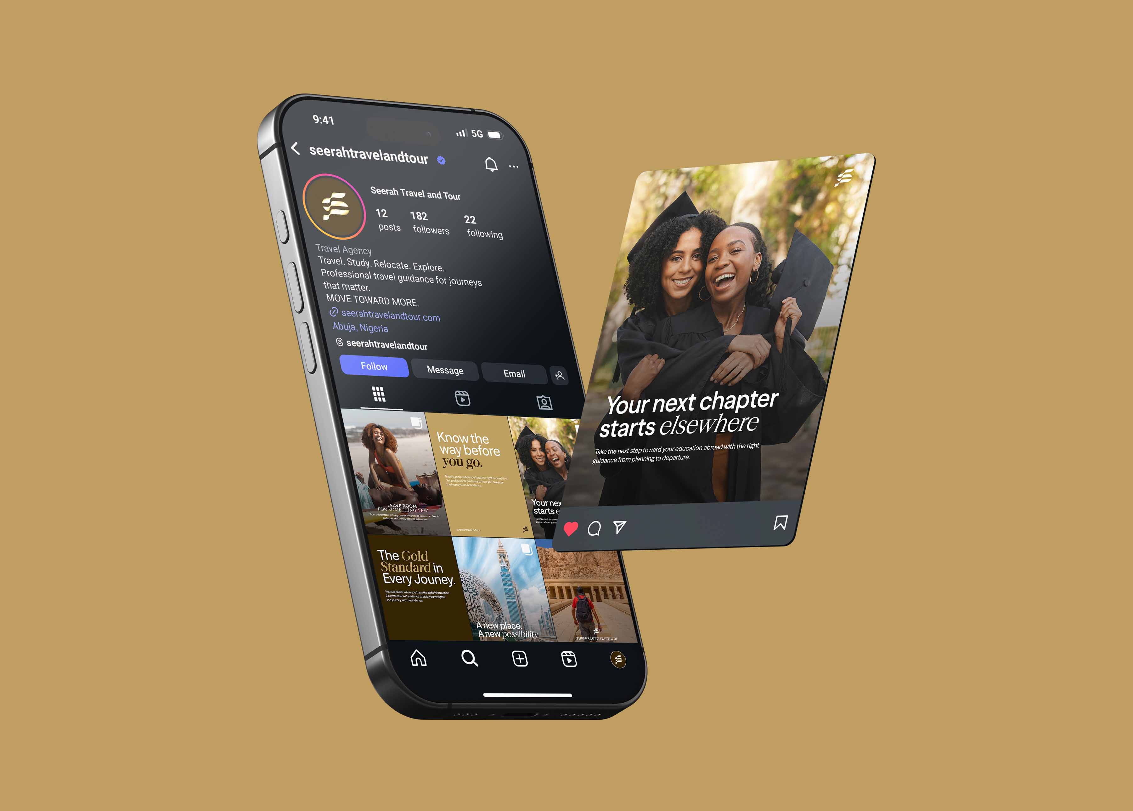
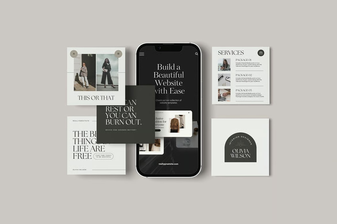
Building a Social Media Style Guide for a Consistent Brand: 7 Proven Elements to Include

A social media style guide is a focused document that defines exactly how your brand looks and sounds on social channels: the colours, fonts, visual style, voice, and posting rules that anyone creating content can follow to stay consistent. It’s the practical tool that turns “we should be more consistent on social” into something a whole team can actually execute, without every post depending on one person’s memory.
If your social media branding is the goal, the style guide is how you reach it reliably. This guide covers what to include, why each part matters, and how to make a guide people use.
Why a social media style guide matters
Social content is usually created by more than one person: a founder, a marketer, a freelancer, an intern, or an agency. Without a shared reference, each of them makes different choices, and the feed slowly fragments. A style guide solves this by writing the brand down, so consistency doesn’t depend on who happens to be posting.
It does three practical things:
- Removes guesswork. People stop wondering which font, colour, or tone to use; the guide answers it.
- Protects consistency as you scale. New team members and vendors can get up to speed quickly and stay on-brand.
- Speeds up content creation. Clear rules and ready answers mean less back-and-forth and faster production.
What to include in a social media style guide
A useful guide is specific to social, not a copy of your full brand book. Cover these areas.
1. Brand basics for social
A short summary of who the brand is, who it’s for, and its personality- enough context that someone understands the spirit behind the rules, not just the rules.
2. Visual identity
- Colours: your social palette with exact values, and how to combine them.
- Fonts: the typefaces and how to use them in graphics.
- Logo usage: which logo version to use as a profile picture and within posts, and the rules for clear space and minimum size.
- Graphic style: the look of your graphics, icons, and visual devices, with examples.
3. Imagery and photography style
What your images should look and feel like, the style of photography, the mood, any filters or treatments, and what to avoid. This keeps the visual world coherent even when different people source images.
4. Templates
Reference to your post and story templates and rules for using them, so the team builds on the system rather than around it.
5. Voice and tone
How the brand writes: its personality, the tone for different contexts (a celebratory post versus a customer-service reply), words and phrases to use and avoid, and emoji and hashtag conventions. Include before/after examples; they teach voice faster than description.
6. Platform-specific notes
Each platform has different norms, formats, and audiences. Note how the brand adapts, for example, a more polished tone on LinkedIn versus a more casual one elsewhere, while staying recognisably the same brand. Include the right image sizes for each platform.
7. Posting conventions
Practical rules: hashtag strategy, how to handle replies and comments, link conventions, and anything else that affects consistency in how the brand shows up day to day.
How to make a style guide people actually use
The same principle that governs any brand guidelines applies here: a guide nobody opens protects nothing.
- Keep it lean. Cover what’s needed clearly; don’t bury the useful parts under length.
- Make it visual. Show, don’t just tell; examples of right and wrong land faster than paragraphs.
- Make it findable. Store it where the team works, as a living document that’s easy to update.
- Include the assets. Link the actual fonts, colour values, logo files, and templates, so people don’t improvise.
- Keep it current. Update it as the brand evolves, so it never spreads outdated rules with authority.
A lean starter structure
If you’re building one from scratch, this order works:
- Who we are (brief)
- Colours and fonts
- Logo and profile branding
- Graphic and imagery style
- Templates
- Voice and tone (with examples)
- Platform notes and image sizes
- Posting conventions
Start lean and expand only where real inconsistency shows up. A short guide that’s used beats a thorough one that isn’t.
Frequently asked questions
What is a social media style guide?
It’s a document that defines how your brand looks and sounds on social media: colours, fonts, logo usage, graphic and imagery style, voice and tone, templates, platform notes, and posting conventions. It lets anyone creating content stay consistent and on-brand.
What’s the difference between a social media style guide and full brand guidelines?
Full brand guidelines cover the entire brand across all touchpoints. A social media style guide is a focused subset tailored to social formats and platforms, showing how the brand adapts to posts, stories, profiles, and platform-specific norms while staying consistent with the core brand.
Who needs a social media style guide?
Any business where more than one person creates social content, or that wants its social presence to look professional and consistent. Even a solo founder benefits, because it makes content faster to produce and easier to hand off as the business grows.
How detailed should it be?
Detailed enough to remove guesswork, lean enough that people actually use it. Cover colours, fonts, logo, imagery, voice, templates, and platform sizes clearly, with examples. Start short and expand only where inconsistency appears in practice.