Instagram Grid Design: Creating a Feed That Looks Intentional (4 Proven Approaches)

Instagram grid design is the practice of planning how your posts look together as a whole- the grid a visitor sees when they land on your profile- so the feed reads as an intentional, cohesive brand rather than a random pile of images. When someone considers following you, the grid is the first impression they judge, and a cohesive grid signals a brand worth following far more than any single post does.
This guide covers why the Instagram grid design matters, the main approaches to designing one, and how to keep it cohesive without becoming so rigid that posting feels like a chore.
Why the grid is a first impression
When a new visitor reaches your profile, they don’t see one post; they see nine at once, then the whole feed as they scroll. In a few seconds, they form a judgement: does this look like a coherent, credible brand, or a disorganised stream? That judgement heavily influences whether they follow.
A cohesive Instagram grid design does several things at once:
- Signals professionalism. A considered feed tells visitors you take your brand seriously.
- Strengthens recognition. A consistent look reinforces your social media branding and makes your content recognisable in the feed, not just on your profile.
- Earns the follow. People follow accounts that feel like a coherent thing worth following.
The grid is where your individual posts add up to a brand.
Approaches to Instagram grid design design
There’s no single “correct” grid. The main approaches, from simplest to most involved:
1. Consistent style (the most sustainable)
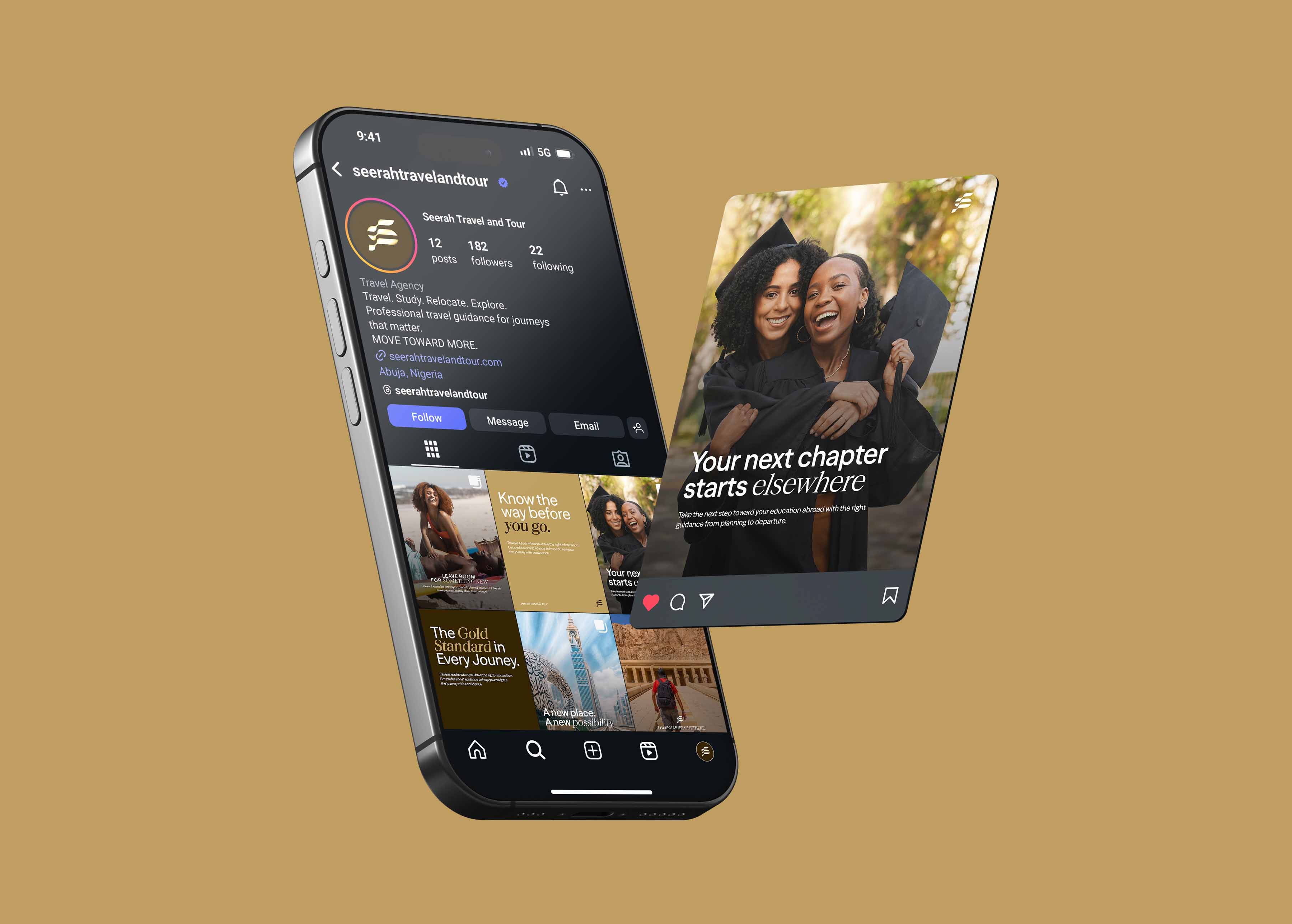
Rather than controlling the exact arrangement, you keep every post in a consistent visual style, the same palette, fonts, treatment, and mood. The grid looks cohesive because the pieces are cohesive, no matter the order. This is the most practical approach for most brands because it doesn’t require planning posts in a fixed sequence.
2. Colour cohesion
You maintain a consistent colour story across posts so the feed shares a palette. Posts can vary in content but feel unified through colour. Effective and not overly restrictive.
3. Alternating or patterned Instagram grid design
You deliberately alternate post types, for example, a quote, then a photo, then a graphic, repeating to create a rhythm down the feed. This creates visual structure but requires more planning to maintain.
4. Puzzle or panoramic Instagram grid design
The most ambitious: posts are designed to connect into a larger image or pattern across the grid. Striking, but rigid and high-maintenance, every post has to fit the puzzle, which limits spontaneity. Use sparingly, if at all.
For most brands, a consistent style (approach 1) delivers most of the benefit with the least friction.
How to plan a cohesive grid
- Define your visual style. Decide the palette, fonts, treatment, and mood for your posts, ideally documented in your social media style guide.
- Use templates. Consistent templates naturally produce a cohesive grid, because every post is built on the same system.
- Preview before you post. Planning tools let you see how a new post will sit in the grid before it goes live, so you can keep the feed balanced.
- Balance variety and consistency. A grid that’s too uniform becomes monotonous; one that’s too varied looks chaotic. Aim for consistent style with enough variety to stay interesting.
- Review the whole feed periodically. Step back and look at the grid as a visitor would. Does it look like one intentional brand?
Don’t let the grid limit your content
Here’s the important caveat: grid aesthetics should serve your brand, not handcuff it. The most beautiful grid is worthless if the obsession with it stops you from posting valuable, timely content. Rigid puzzle grids in particular can become a trap; you delay or skip posts because they don’t fit the pattern.
The healthier mindset: keep a consistent style so the grid stays cohesive automatically, and let that free you to post what matters when it matters. Cohesion should be a by-product of a good system, not a constraint you fight against every time you post.
Frequently asked questions
What is Instagram grid design?
It’s planning how your posts look together as a whole on your profile, so the feed appears intentional and cohesive rather than random. Because visitors judge your profile by the grid before following, a cohesive grid strengthens your brand and earns more follows.
How do I make my Instagram feed look cohesive?
The most sustainable way is to keep every post in a consistent visual style, same palette, fonts, treatment, and mood, usually by building posts from consistent templates. The feed then looks unified because the individual posts are, without needing a rigid arrangement.
Do I need a puzzle or panoramic grid?
No. Puzzle grids look striking but are rigid and high-maintenance, since every post must fit the pattern. For most brands, a consistent style or colour story delivers a cohesive feed with far less friction and without limiting what you can post.
Should grid aesthetics limit what I post?
No. A cohesive Instagram grid design should be a by-product of a consistent style, not a constraint that stops you from posting valuable or timely content. If maintaining the Instagram grid design is making you skip posts that matter, the system is too rigid; simplify it.