Tosyno Chips
Print production for chips packaging.
Packaging
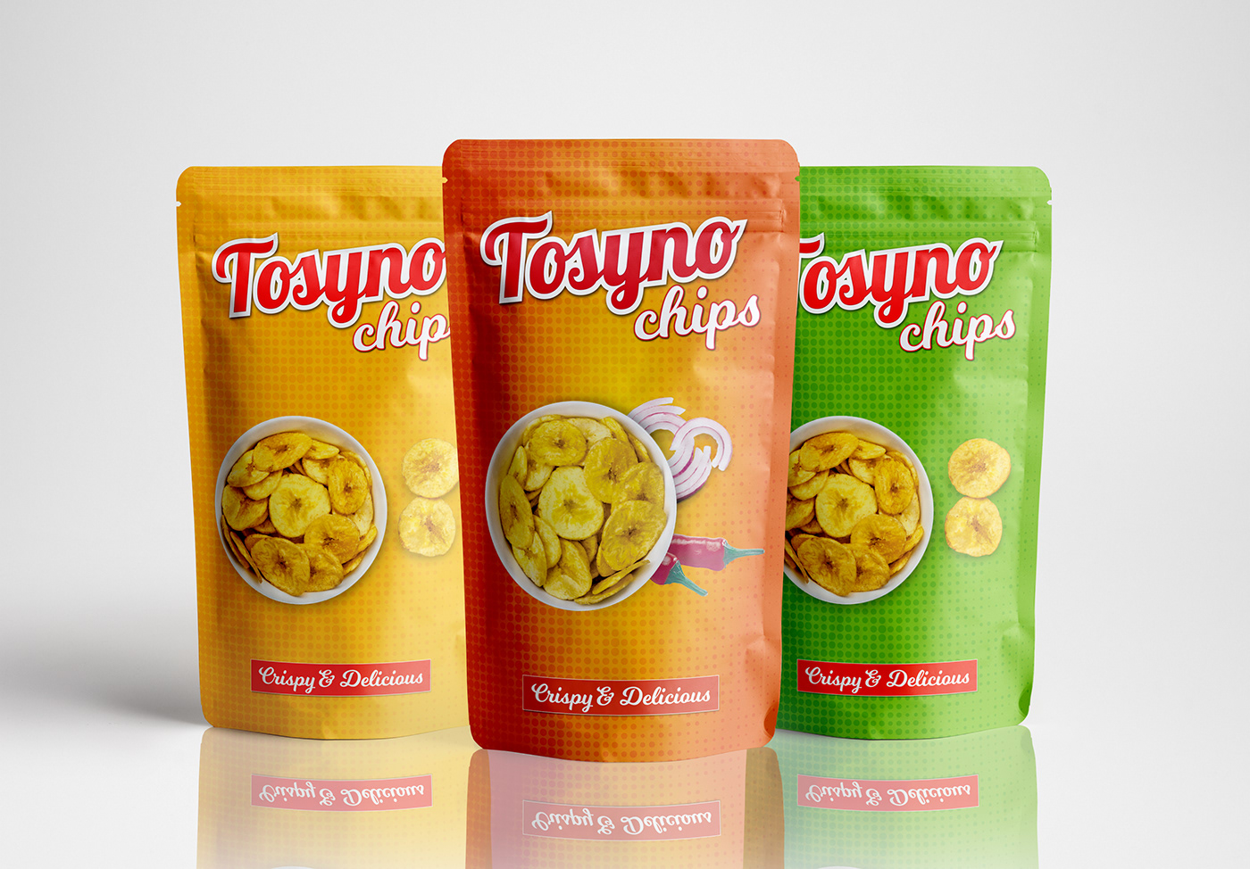
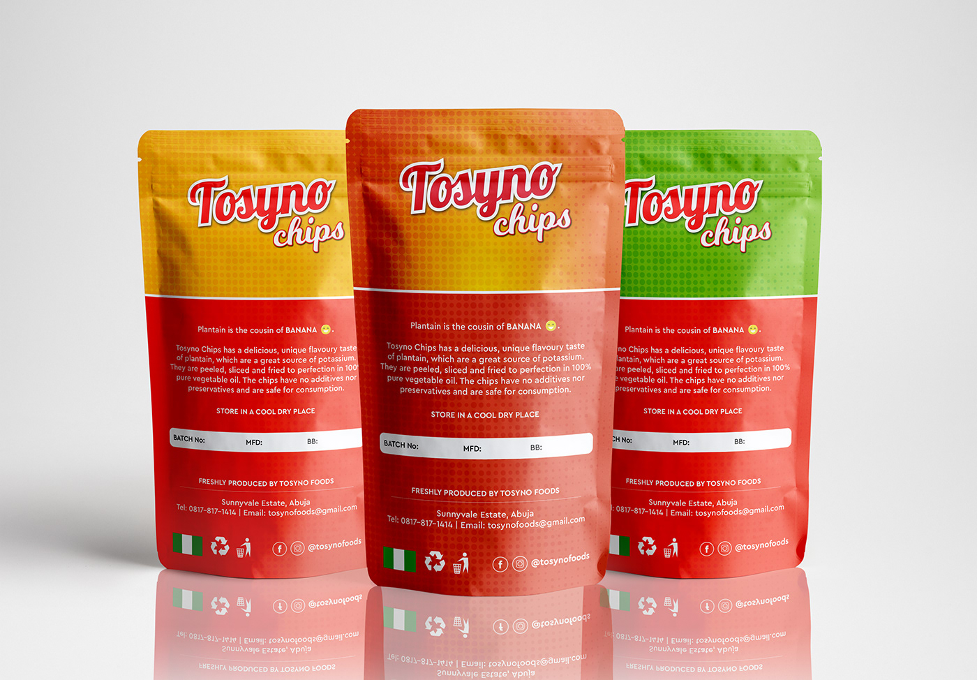
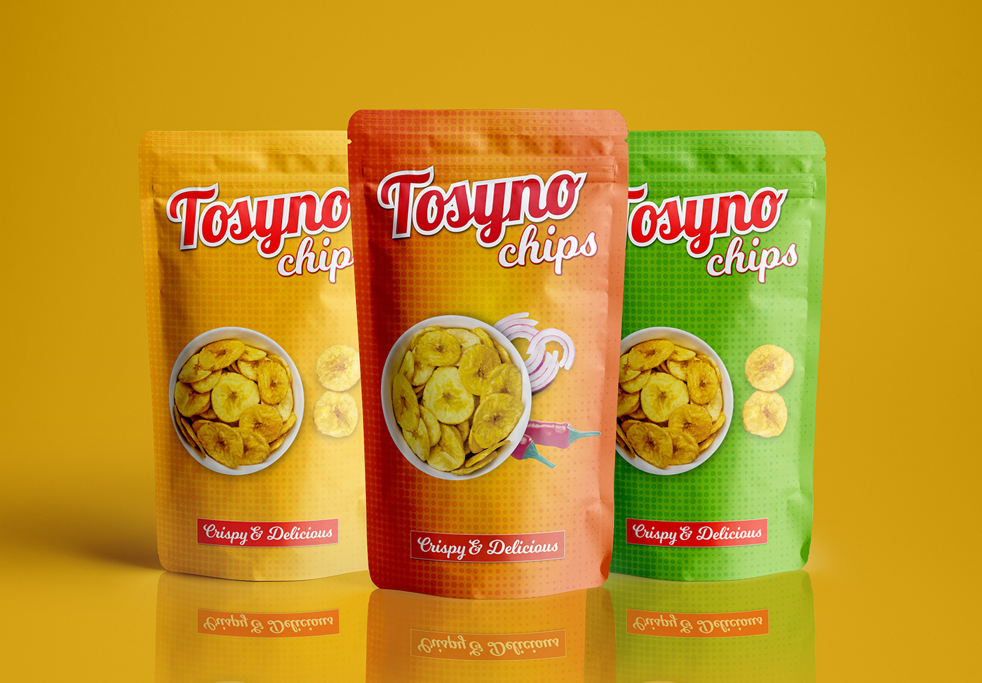
We designed and managed the print production for Tosyno Chips packaging. The project featured three distinct variants: Unripe, Ripe, and Ripe & Spicy. Each product variant features a consistent design layout for brand unity, while vibrant colors were strategically chosen to reflect their unique characteristics. Green for Unripe Chips, inspired by the natural color of unripe plantain skin. Yellow for Ripe Chips, symbolizing the golden hue of ripe plantain skin. Orange for Ripe & Spicy Chips, representing the fiery tones of pepper and spices. This thoughtful approach ensured easy product differentiation, a visually appealing shelf presence, and a strong connection to the brand.


