Soyuz Energy Services Ltd.
Integrated branding and web design for an energy solutions company.
Visual Design
Web Design
Content
Ongoing Support

Soyuz Energy Services Limited is a provider of innovative energy service solutions that sustain the complete life cycle of their clients’ businesses and assets.
The objective of the project was to develop a company website and visual identity that exudes authenticity, trust, and durability while boldly asserting its presence among industry peers and competitors.
The result is a commanding brand visual that stands as a symbol of innovation and distinction.

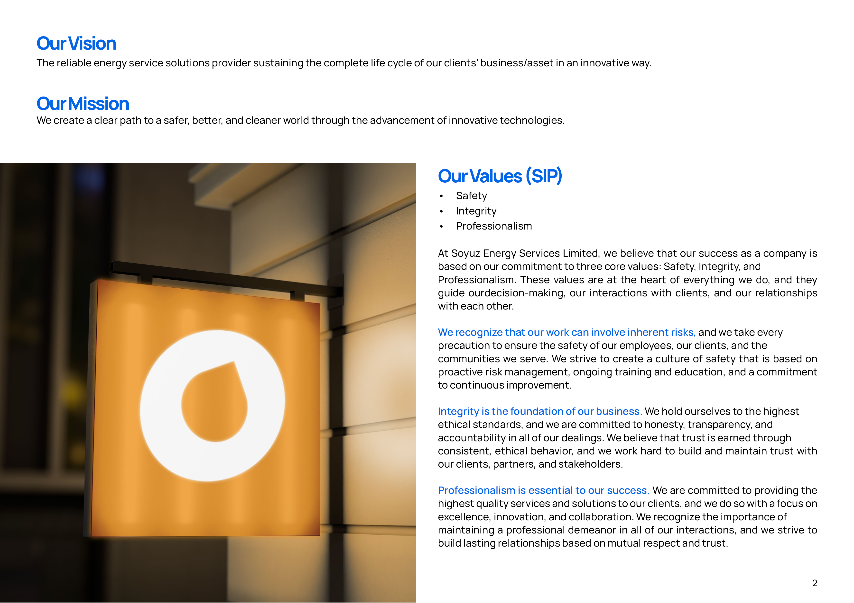
By integrating negative space, notably in the form of the letter “O,” and employing circular design elements reminiscent of an oil droplet, the identity skillfully merges symbolism and aesthetics.
Typography, specifically a bold slab-serif typeface, was carefully chosen for its strong presence and uniqueness. The strategic use of italicized text adds dynamism without overwhelming the overall design.

The color palette, featuring blue and orange, sets Soyuz Energy Services Limited apart from the norm, aligning perfectly with the brand’s mission and reinforcing its dedication to excellence in the energy sector.


The scope of the project extended into the digital domain, resulting in the development of a company website.

