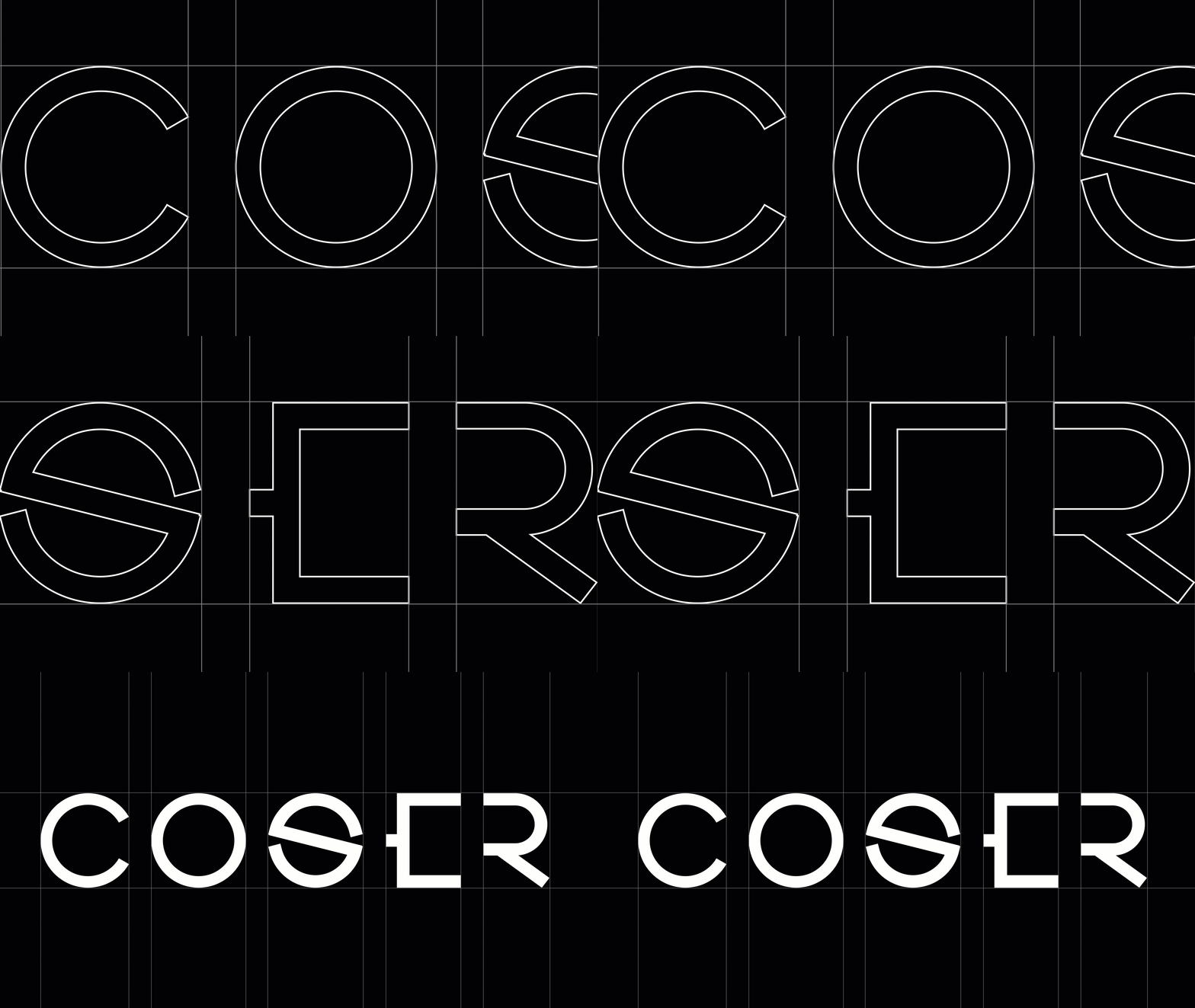


An adaptive brand system is an identity designed to flex across contexts — scaling, simplifying, and rearranging itself so it stays clear and recognisable whether it’s a 16-pixel favicon, an app icon, a social avatar, or a billboard. Instead of one fixed logo forced awkwardly into every space, an adaptive system gives you a family of considered variations that all unmistakably belong to the same brand.
This is one of the defining shifts in branding for 2026: identities are moving away from rigid, single-lockup logos toward flexible systems built for an unpredictable, multi-screen world. Here’s why fixed logos fail, what an adaptive system contains, and how to build one.
Why a single fixed logo breaks in 2026
Your brand has to appear in more places, at more sizes, than ever before — and many of those places are tiny, square, or moving. A detailed horizontal logo that looks great on a website header turns into an illegible smudge as a favicon or a social profile picture. A wordmark with fine detail disappears at app-icon scale.
When a brand only has one fixed asset, every team improvises. Someone crops the logo for the avatar, someone else stretches it to fit a banner, a third person recreates it badly because the right file wasn’t available. The result is a brand that looks slightly different everywhere — which quietly erodes the recognition you’re working so hard to build.
Adaptive systems solve this by deciding the variations in advance, so nobody has to improvise.
What an adaptive brand system includes
An adaptive identity is a coordinated set of assets and rules. The core elements:
1. A responsive logo family
Rather than one logo, you design a graded set of versions for different sizes and spaces:
- Primary lockup — the full logo, used where there’s room to breathe.
- Secondary/compact version — a simplified arrangement for tighter spaces.
- Logo mark / symbol — the standalone icon that works at small sizes and as an app icon or favicon.
- Monogram or reduced mark — the most stripped-back version for the smallest contexts.
Each step removes detail while keeping the brand recognisable. The favicon and the billboard are clearly the same brand — they’re just speaking at different volumes.
2. A flexible colour system
Modern brands increasingly define a mood through colour rather than locking themselves to one rigid pair. That means a core palette plus defined ways it can flex — a fuller range for campaigns, accessible combinations for interfaces, and clear rules so flexibility never becomes chaos.
3. A type system that scales
Typography that works as an oversized headline and as small interface text. Adaptive systems define how type behaves across these extremes so the brand reads consistently from a hero banner down to a caption.
4. Modular graphic elements
Patterns, shapes, icons, and layout principles that can be recombined for different formats. These are what let a brand fill a square, a vertical story, a wide banner, and a print page while still feeling like one system.
5. Clear rules
None of the above works without brand guidelines that say which version to use where. Flexibility without rules produces inconsistency; flexibility with rules produces range.
Adaptive vs. flexible vs. responsive: a quick clarification
These terms get used loosely. In practice they describe the same underlying idea — an identity that changes form to suit its context while keeping a consistent core. “Responsive logo” usually refers specifically to the size-based logo family; “adaptive” or “flexible brand system” describes the whole coordinated identity. What matters isn’t the label but the principle: design for variation deliberately.
The benefits of building adaptively
- Recognition holds everywhere. Because every version is intentional, your brand reads as itself across every surface, which compounds into stronger recognition over time.
- Teams stop improvising. With the right asset ready for every context, you remove the daily small decisions that drift a brand off-course.
- The brand ages better. A system can flex with new platforms and formats without a full rebrand — you extend it rather than replace it.
- It works at favicon scale. In 2026, logos are routinely judged at the size of a browser tab icon. A system that’s designed for that scale wins; one that isn’t disappears.
How to build an adaptive brand system
If you have a single logo today, here’s the path to a flexible system:
- Start from a strong core. Adaptivity is not an excuse for a weak central idea. The system flexes around a clear brand strategy and a confident primary mark.
- Design the logo family in steps. Create the primary, compact, mark, and reduced versions deliberately, testing each at the size it’ll actually be used.
- Stress-test at the extremes. Place each version where it’ll live — favicon, app icon, social avatar, banner, print — and fix what breaks. The extremes reveal the weaknesses.
- Define the flexible colour and type rules. Decide the core, the range, and the boundaries.
- Build the modular kit. Patterns and layout principles that let any team assemble on-brand content for any format.
- Document everything. Put it all in guidelines that make the right choice obvious, so the system survives contact with real-world use.
A common mistake to avoid
Adaptive does not mean “anything goes.” The failure mode is treating flexibility as permission for every team to do whatever they like. A real adaptive system is more disciplined than a single logo, not less — it has more rules, because it has more variables to keep coherent. The freedom is in the range of approved options, never in abandoning the system.
Frequently asked questions
What is an adaptive brand identity? An adaptive brand identity is a flexible system of coordinated logo versions, colours, type, and graphic elements designed to flex across different sizes and platforms while staying recognisable. Instead of one fixed logo, you have a family of intentional variations governed by clear rules.
Why isn’t one logo enough anymore? Because your brand now appears at extreme size differences and in square, vertical, and moving formats. A single detailed logo becomes illegible as a favicon or app icon, so brands design a graded family of versions to stay clear everywhere.
What’s the difference between an adaptive system and a brand refresh? A refresh updates the look of an existing brand. An adaptive system changes the structure — building variation and rules in from the start so the brand can flex across contexts without needing constant redesign.
Does my small business need an adaptive brand system? If your brand appears across a website, social platforms, an app, and print, then yes — even a small business benefits from having the right logo version ready for each context rather than improvising. The system can be lean; it just needs to be deliberate.
One brand, many forms, zero confusion
The brands that feel solid across every screen and surface aren’t using the same logo everywhere — they’re using a system that knows how to change shape without losing its identity. In a world where your brand has to fit a browser tab and a billboard in the same week, that flexibility isn’t a luxury. It’s how recognition survives.
Tagged with :